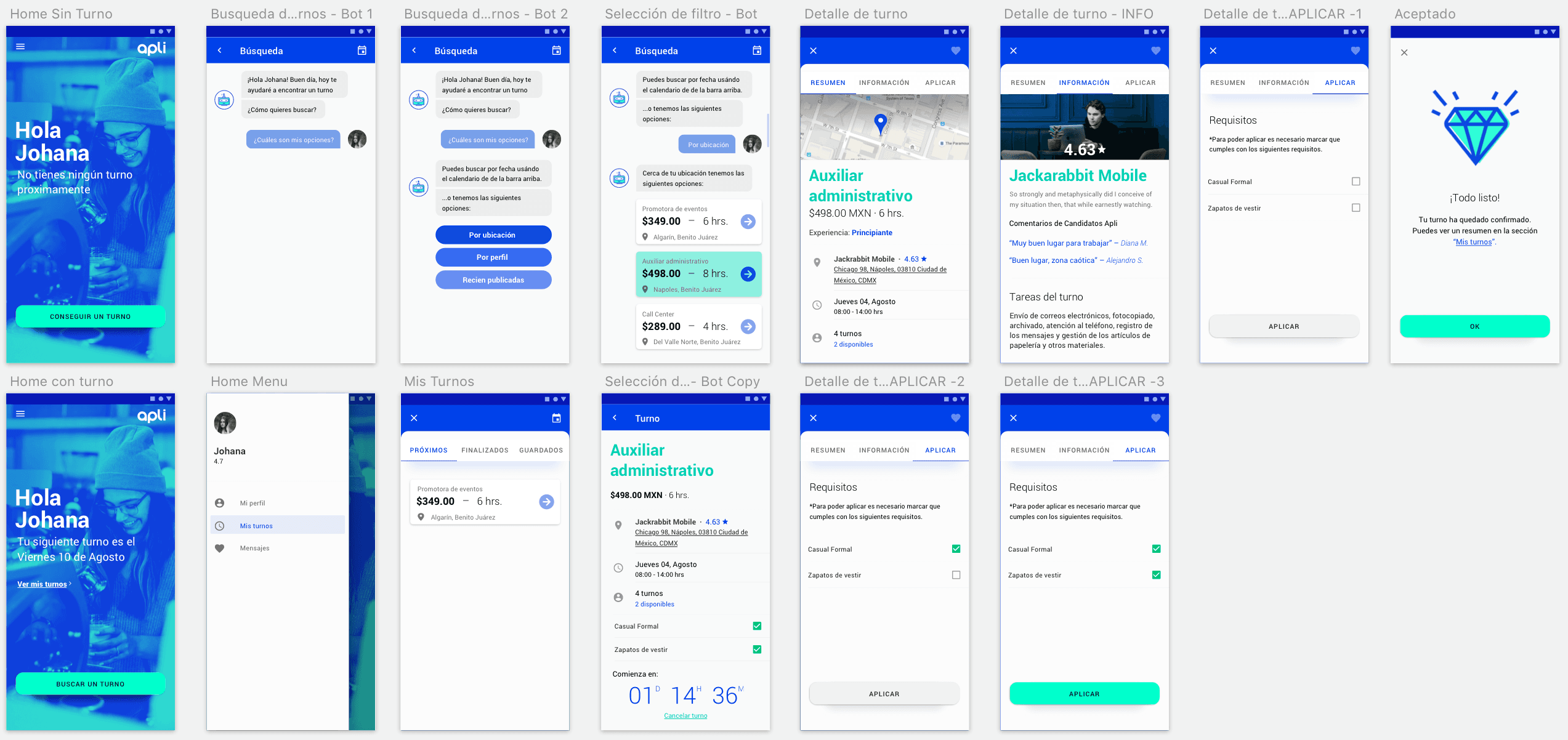
The Second Shift: Apli Candidates App
Apli ran entirely through a Facebook Messenger bot — no app, just conversation. It worked well enough to get people in the door, but most never came back. This case study covers the research behind that drop-off, and the candidate app I designed to fix it as my UX/UI capstone project at Ironhack, built in partnership with Apli's team.

Client
Apli
Industry
Human Resources
Year
August 2018
Role
Product Designer
Skills
User Research JTBD Journey Mapping Product Design Usability Testing
The Problem
By the time of this project, Apli had real traction: 44K Facebook followers, the #1 spot in its category, and hundreds of shifts filled a day. But under the growth number was a retention problem — fewer than half of activated candidates ever came back for a second shift.
The bot-only model carried a second risk. Recent history — Zynga's collapse alongside Facebook's algorithm changes, publishers losing traffic overnight when Facebook deprioritized them, WhatsApp starting to charge businesses for messages — made the case that a company built entirely on someone else's platform doesn't fully control its own experience.
My task was to find out why candidates weren't returning, and design toward a native app Apli could actually own.

Research & Insights
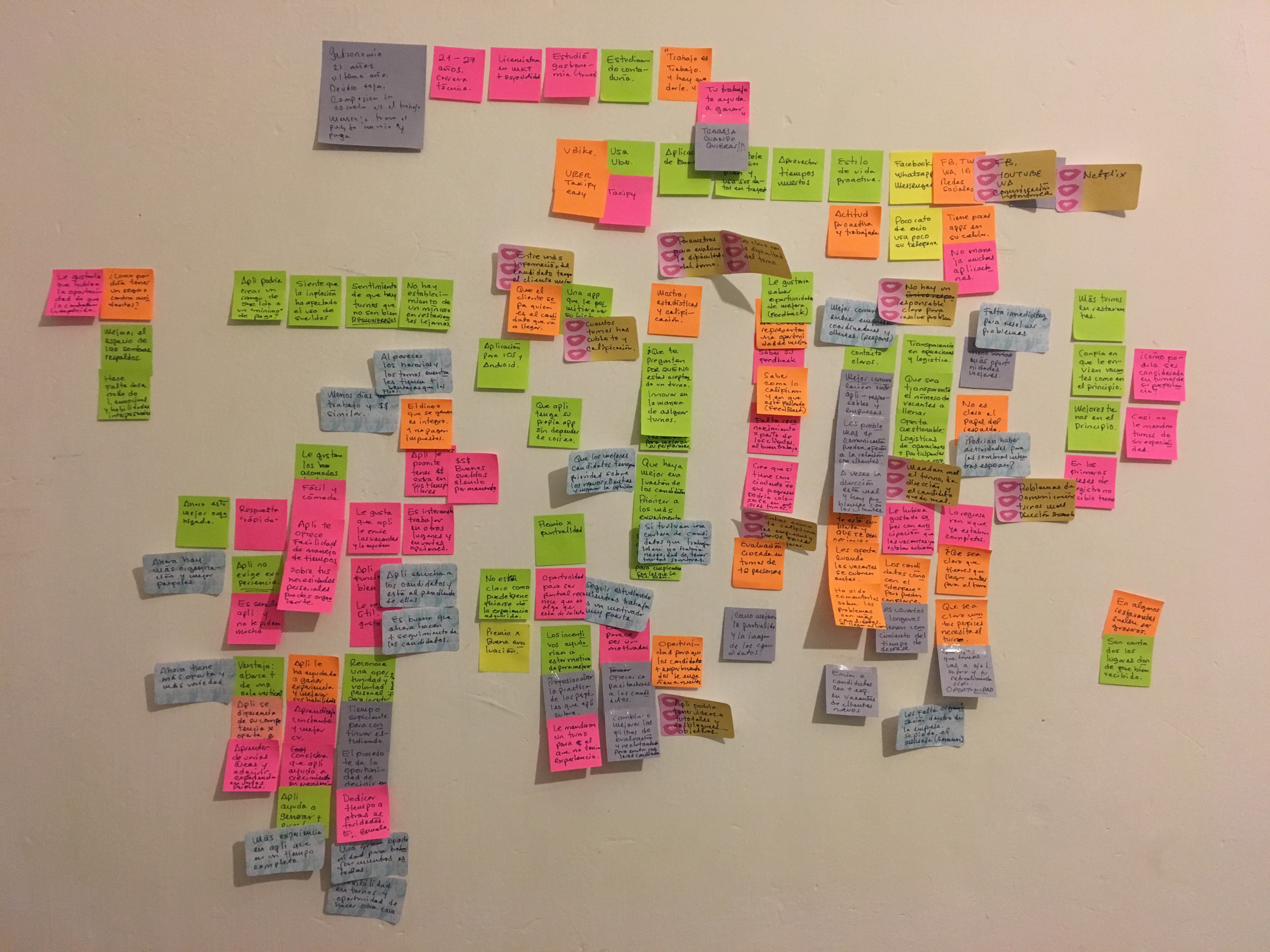
I interviewed two segments — recurring candidates and candidates who'd stopped using Apli — using a JTBD-style guide built around their context, goals, and pains, alongside a competitive scan against similar gig platforms like Wonolo, Shiftgig, and Momlancers.
One theme cut across both segments: communication broke down at nearly every step.
Active candidates had no clear point of contact when something went wrong, no visibility into shift logistics (showing up to find the spot already filled), and no idea whether their rating was helping or hurting them.
Churned candidates cited shifts that didn't match their profile, thin detail on what a shift actually involved, and no clear way to give feedback — reinforcing that Apli didn't feel invested in them.
Both groups wanted more than a job board: a place to see their stats, ratings, and history, and a system that recognized effort instead of cycling them through anonymous shifts.
I built this into a primary persona, Johana — a university student balancing shifts with school — and a full journey map. Mapped end to end, the pattern was visible at a glance: candidate confidence dropped every time a touchpoint depended on someone remembering to follow up manually.


Process
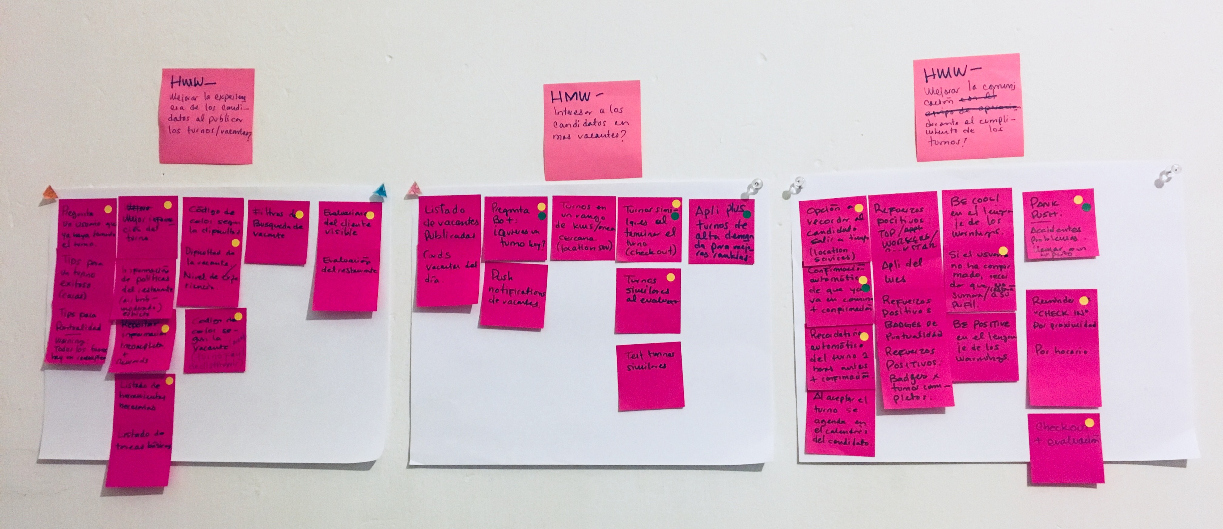
Research resolved into three design challenges:
A. How might we get candidates to proactively search for shifts inside the app?
B. How might we improve the experience when shifts get published?
C. How might we improve communication before and after a shift?
I ideated against all three, then scored the ideas with a MoSCoW matrix weighted toward feasibility over novelty — the goal was a roadmap Apli's small team could actually build. That prioritization shaped most of the design: shift filters, a plain-language task checklist per shift, visible workplace ratings, automated attendance reminders, a one-tap "on my way" confirmation, and a two-tier help system — self-serve first, a direct line to Apli for anything urgent.
Before touching screens, I wrote "Johana's story" — a narrative walkthrough of the proposed experience — and tested it with Apli's team and outside reviewers. Nearly every proposed feature came back rated essential, with feedback that sharpened the design further: a direct channel to the shift supervisor, a way to cancel a shift, and a clear signal that the acceptance checklist needed to be fully confirmed before a shift could lock in.
From there I mapped the full wireflow — search, shift detail, apply, accept, pre-shift reminders, check-in, check-out, evaluation — and built a high-fidelity, conversational prototype that kept the tone candidates already knew from the bot, then ran it through usability testing and iterated.
Outcome
The result was a tested, high-fidelity prototype for a native Apli app: conversational shift search, a detail screen with ratings and a task checklist, one-tap to apply and accept, and a home screen built around one clear next action.
Pre- and post-shift communication was wireflowed and prioritized, but not designed and stayed as a documented next step for Apli's team.
____
Impact & Learnings
As a bootcamp capstone, this project's job was to prove the thinking, not ship a product — so there's no adoption number attached to it. What stuck with me:
Comfort with not knowing is a skill. I learned to move forward productively without having every answer up front.
User conversations surface more than expected. Without a clearly scoped problem, it's easy to get pulled in too many directions.
The right solution is the user's, not the designer's. Effective design means designing for what people actually need, not what looks elegant on paper.