Five More Minutes: a brand proposal for Snoozz
Every mattress brand sells sleep. Snoozz was named after the snooze button — the extra minutes you steal after the alarm. The proposal built the identity around that moment.
Client
Snoozz
Scope
Branding Logo & Identity Iconography Imagery Direction Landing Page Design
Industries
Furniture · Retail
Date
2017
Role
Designer
The name is a snooze button. Not sleep in the abstract, but the specific, universally understood act of deciding you get a few more minutes and the identity had to feel like those minutes.
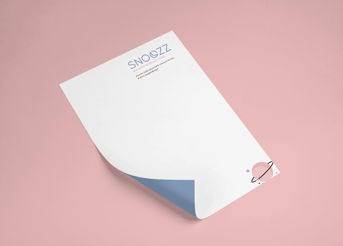
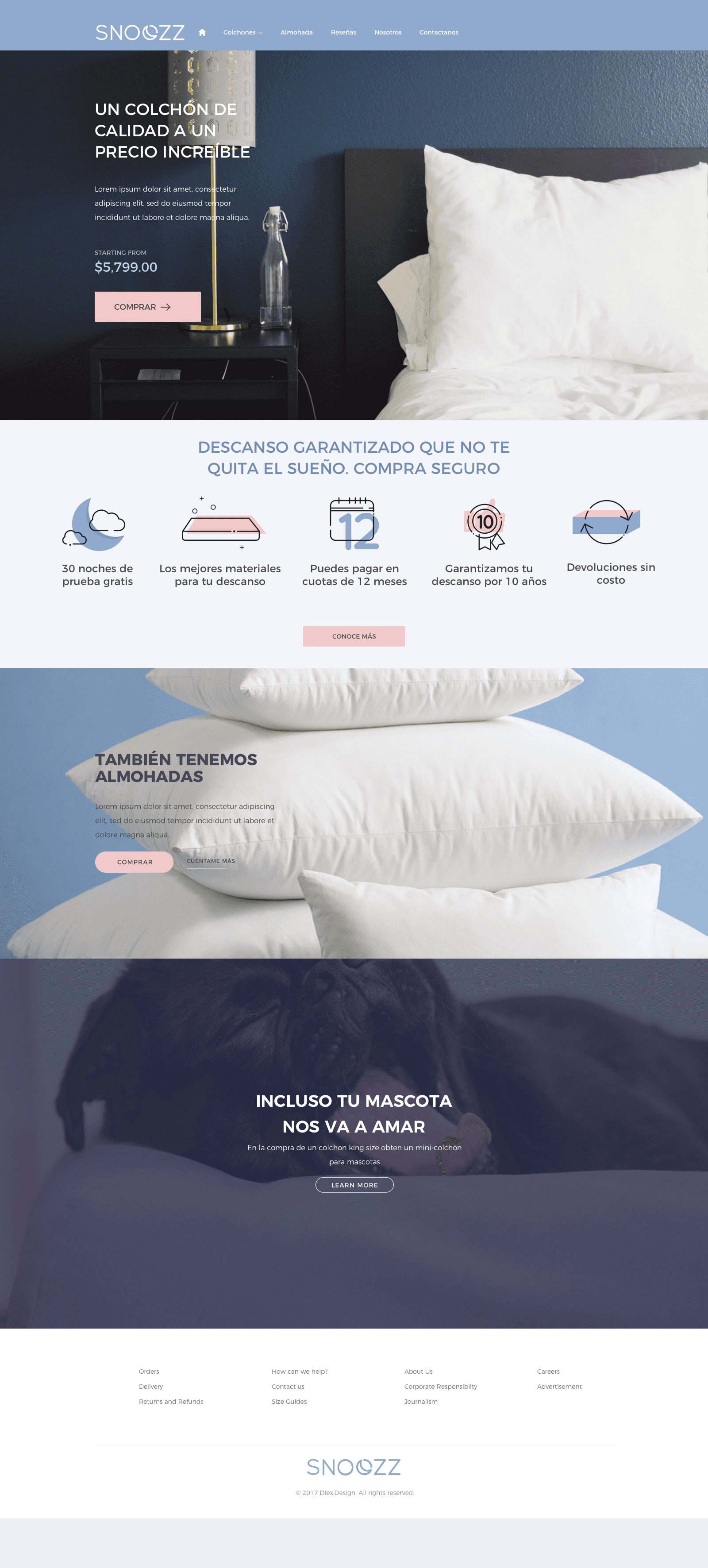
Snoozz was a mattress startup in Spain, built for the bed-in-a-box wave — Casper's model, translated for the Spanish market. The category sold sleep as a performance problem — support, alignment, cooling, the engineering of rest. But the name wasn't pointing at sleep. It was pointing at the small, slightly indulgent decision everyone makes before getting up: the snooze button, the extra minutes. A far warmer thing to own, and one nobody else in the market was claiming. So the system was drawn to feel like that moment rather than describe the product. Roundness carried the softness — curvature is the most reliable visual cue for soft there is, with nothing sharp anywhere in the mark or the icons. The palette went to pink and pale blue: early light through a window, the colors of the hour the name is about. The proposal covered the logo, a custom icon set, imagery direction, and the landing page. The icons carried more weight than usual — a mattress is a hard thing to photograph interestingly, and a drawn visual language gave the site something of its own on a page that would otherwise have been product shots and copy.
The competition was selling sleep. The name was pointing at something better — the part of it you steal.
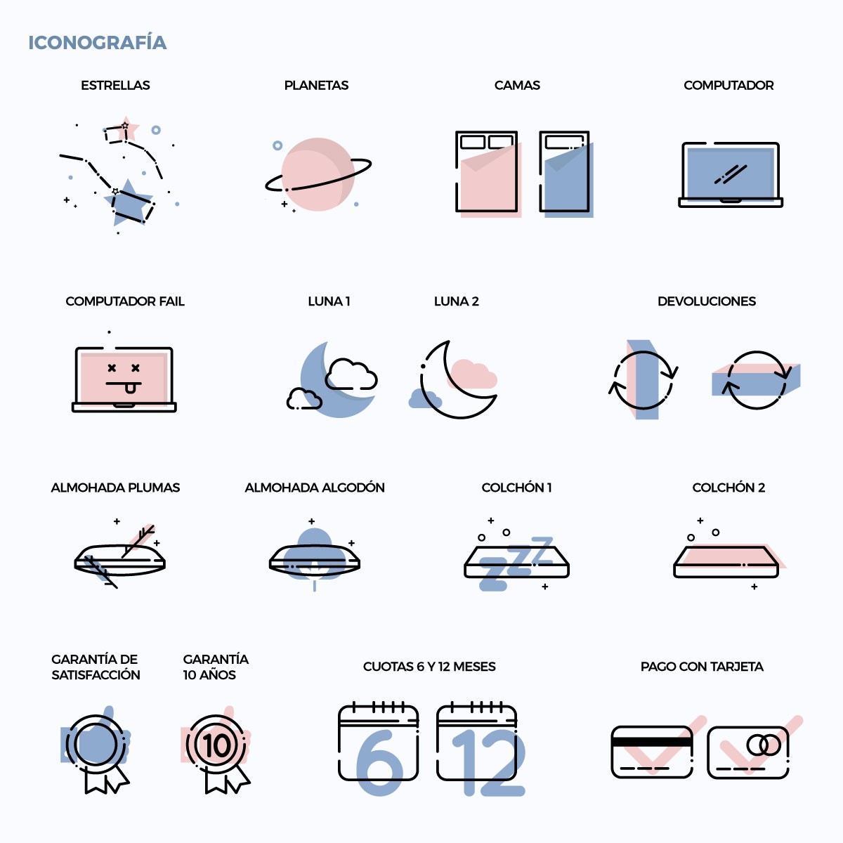
Roundness reads as soft in any language. Pink and pale blue read as six in the morning.