Everything Except the Idea: refining Linio's logo across eight markets
Linio was one of Latin America's largest e-commerce marketplaces, operating across eight countries. Its logo needed to work inside a new design system without spending the recognition it had already earned — so the brief was refinement, not rebrand.
Client
Linio
Scope
Creative Direction Brand Identity Logo Refinement Brand Guidelines Design System
Industries
E-commerce · Retail
Date
2015
Role
Regional Creative Manager
A logo refinement works when nobody notices it happened. Linio's mark carried recognition across eight countries — and a decade, an acquisition and a full reskin later, the letterforms are still the ones drawn in 2015.
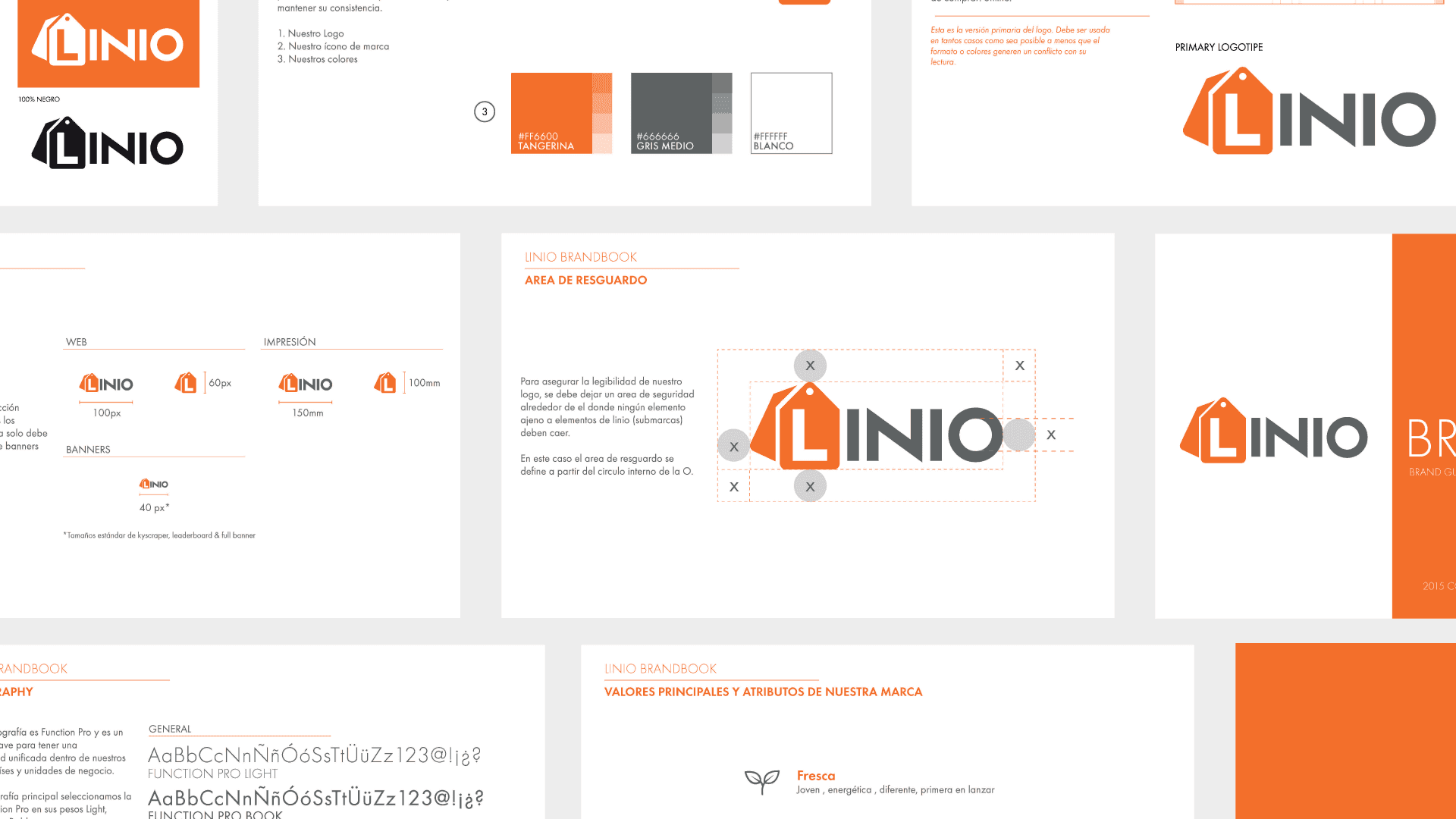
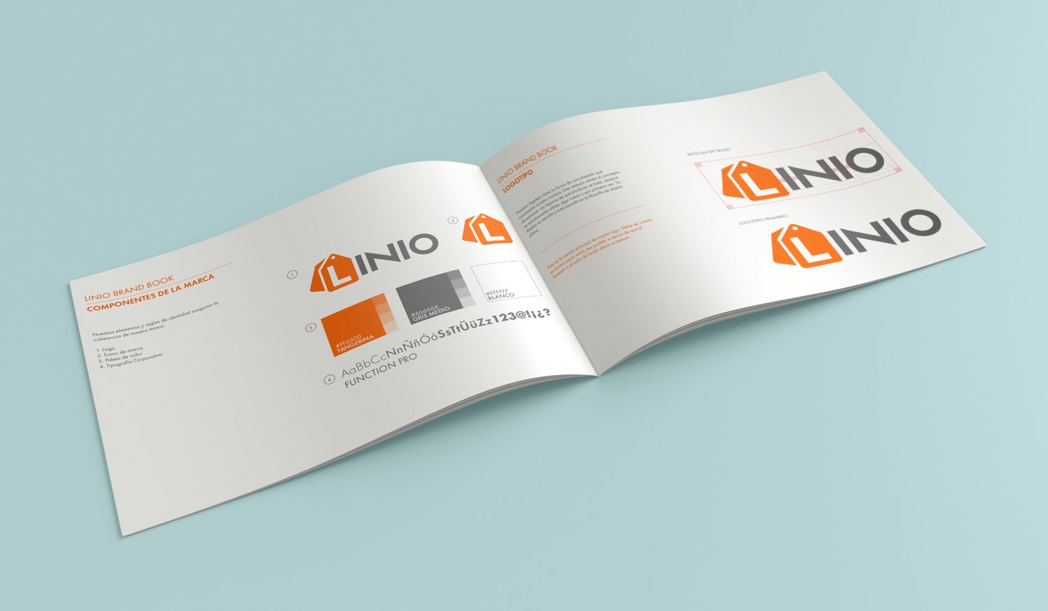
By 2015 Linio was running in eight Spanish-speaking markets across Latin America. The logo had been drawn in the web 2.0 idiom the company launched with, and the product team was building a new design system it no longer sat inside comfortably. It started closer to an irritation: the wordmark alternated capitals inconsistently, and its gradient was awkward to reproduce — small costs paid every time the brand got used. Nowhere near enough, on its own, to justify touching a mark with equity in eight countries. What justified it was timing. A logo change is cheap inside a redesign and expensive on its own. I made that case to the CMO, and consulted with the product design team as their system took shape. The scope followed the same logic. The mark's problem was never its idea, only its execution and its fit, so the work stopped deliberately short of a redraw. But refinement didn't mean neutrality — it still had to move toward something cleaner and more assured, and toward where the industry had landed that year as flat design displaced gloss and depth. For a marketplace, looking current and looking solid usually pull against each other. In 2015 they pointed the same way. Four things changed. Case usage was standardized. Character weights were harmonized so the letterforms held at a single optical weight. The gradient came out, replaced by flat color that reproduced predictably wherever the logo landed. And the palette was brought onto the new system, so the mark and the interface around it stopped being two slightly different brands. None of it is visible on its own. Together it's the difference between a logo the system accommodates and one it's built around.
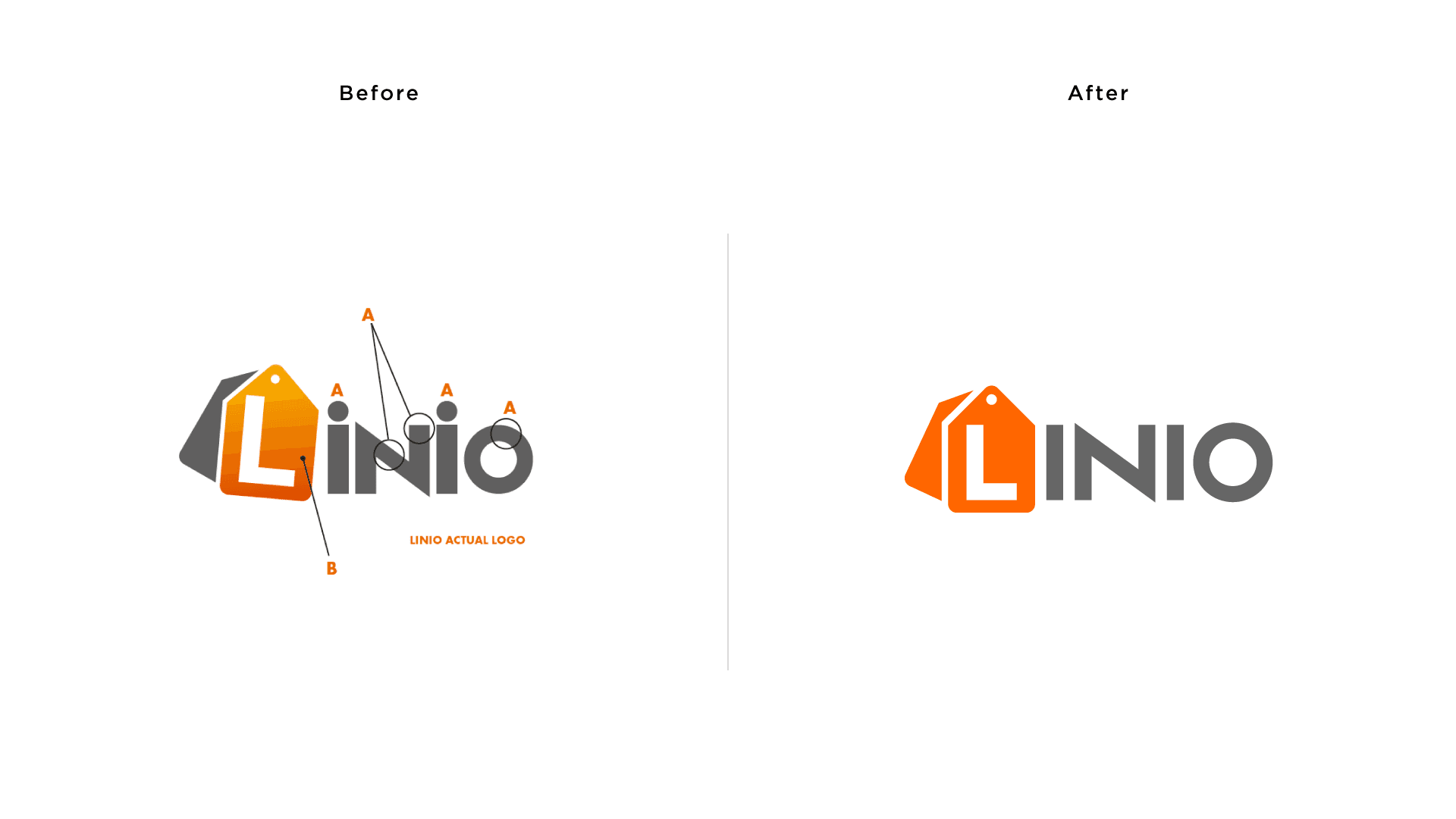
A logo change is cheap inside a redesign and expensive on its own. That timing was the entire argument.
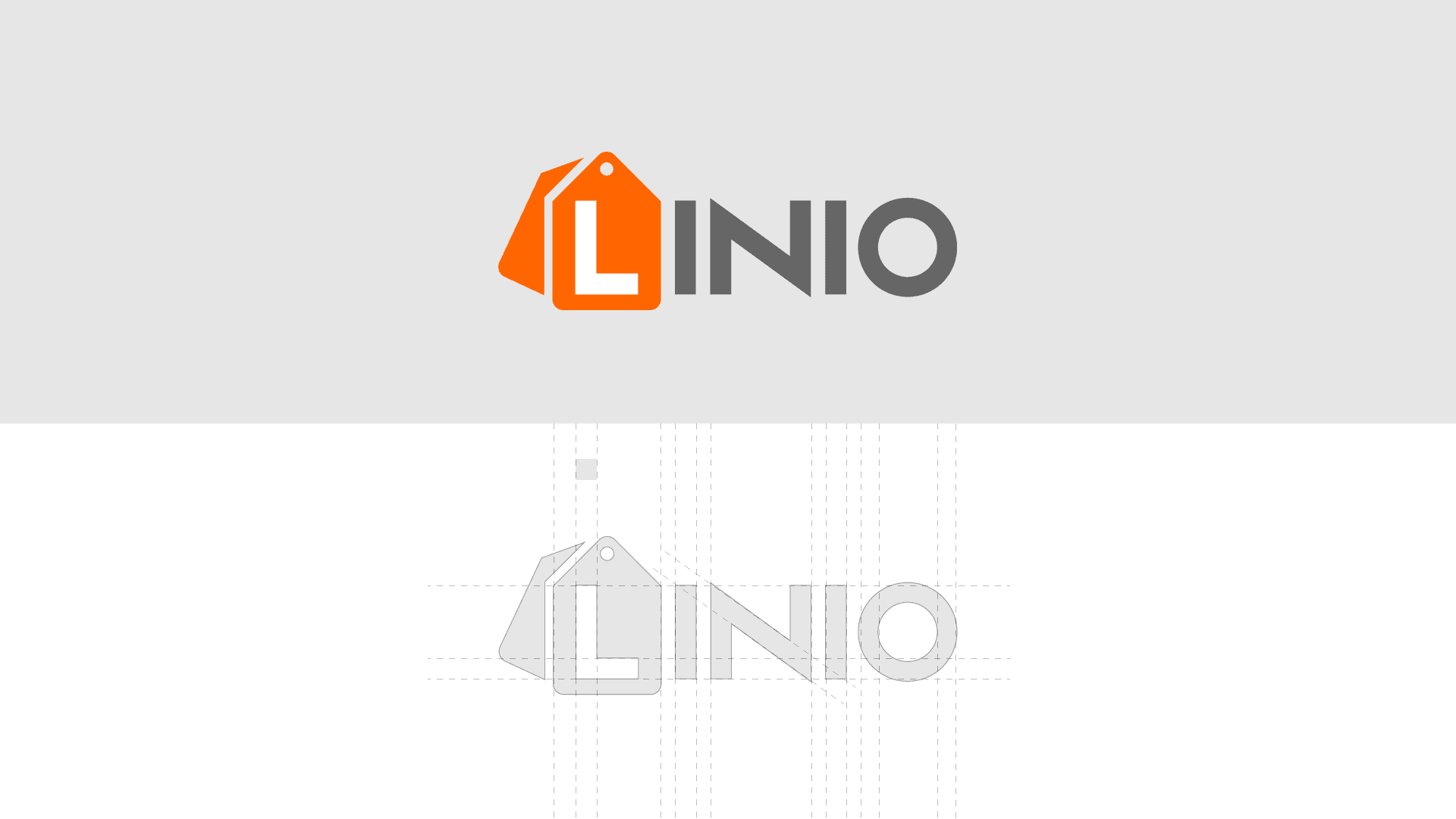
Refined in 2015. The same letterforms a decade later, through an acquisition and everything after it.