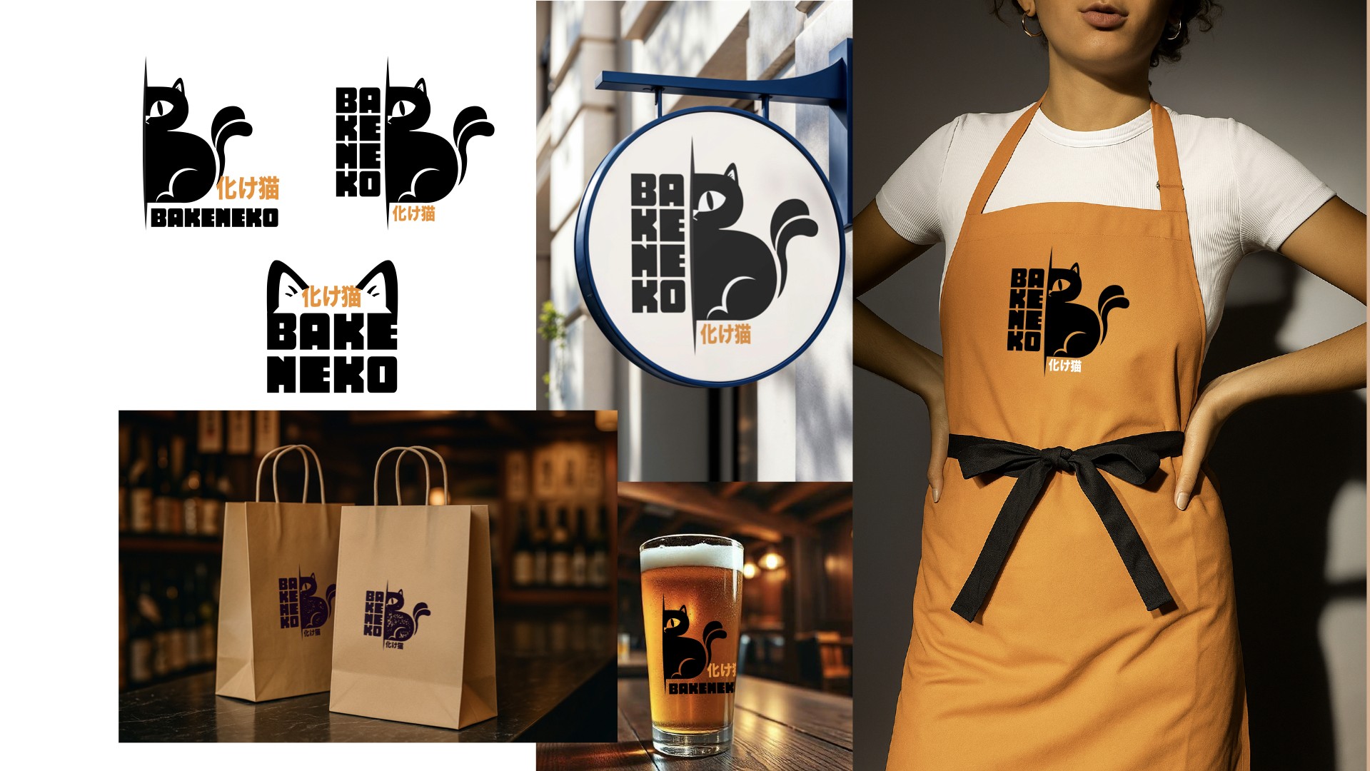
The Shape of a Cat: rebranding Bakeneko izakaya
Sando, takoyaki and house cocktails on Diagonal San Antonio, under a name borrowed from a cat that transforms. ⏐ The old logo transformed into nothing — it just looked like a café. A new identity built on figure and ground, drawn to survive a stamp, an avatar, and a shop sign.
Client
Bakeneko
Scope
Brand Strategy Logo & Identity Menu Design Social Templates Packaging & Signage
Industries
Food & Drink · Hospitality
Date
2025 — ongoing
Role
Brand strategist & designer
A 化け猫 is a cat that lives long enough to transform. Bakeneko had the name but not the mark — its logo was a cat asleep in a coffee cup, and customers were reading the sign and expecting espresso.
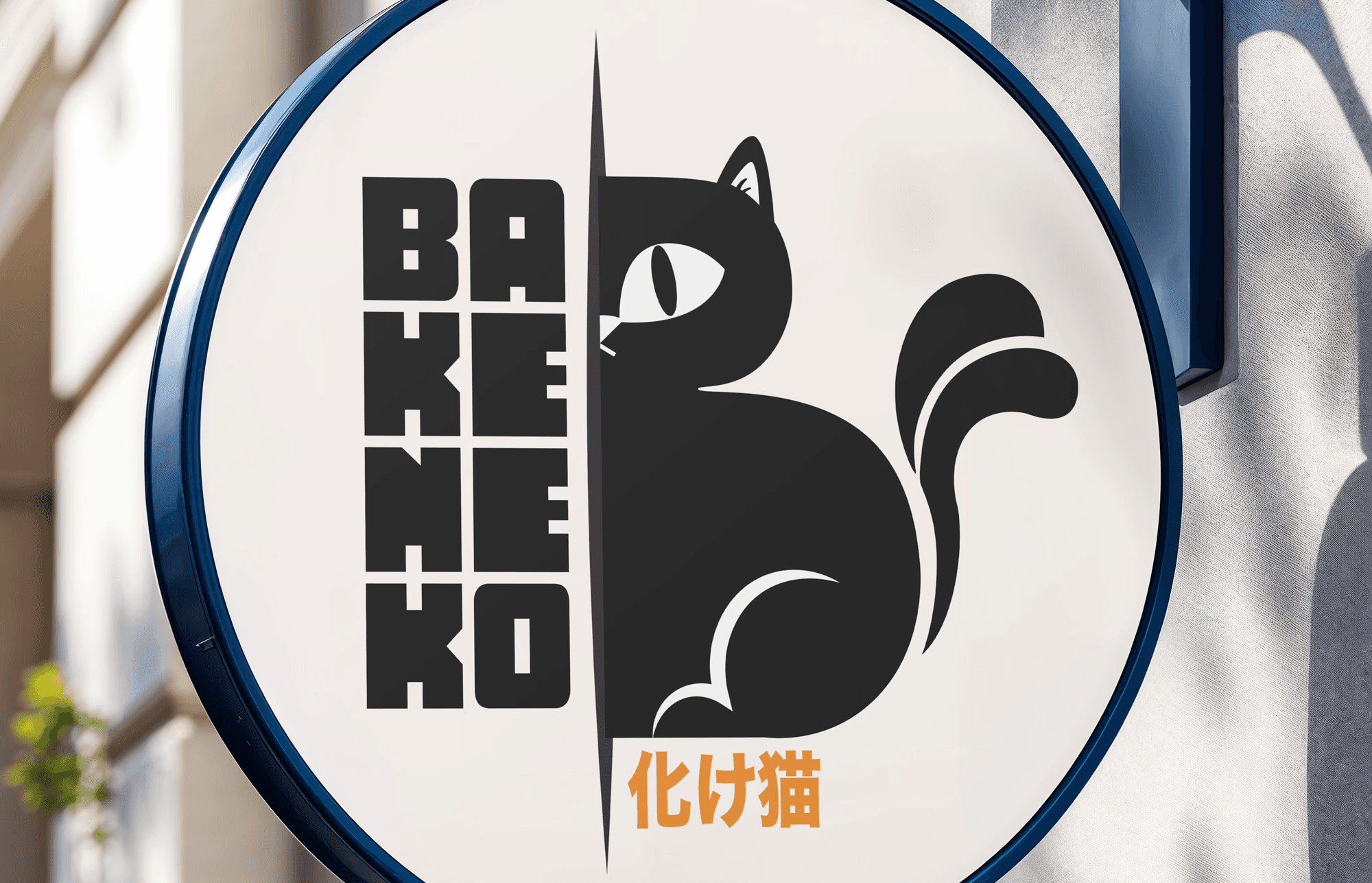
Bakeneko is a small izakaya on Narvarte Poniente (MX), a room that fills after dark. The name comes from Japanese folklore: a cat that survives long enough to transform, gaining supernatural powers and a taste for mischief. A good name for a bar. The identity it arrived with wasn't built to carry it. The old logo was an illustrated cat curled inside a coffee cup, under a brushed lowercase wordmark. The cup was the loudest element in it, so people read the place as a café — the wrong expectation to set before someone walks through the door. The drawing also carried more detail than its working sizes could hold: at avatar scale, on a stamp, in a menu header, the interior linework closed up into a smudge. And there was one lockup for every situation, so it fit none of them well. The owners wanted something more simplified and more hip. My read was that simplification alone wouldn't fix it — the mark needed to say bar and it needed to survive being small. Both problems had the same answer: stop illustrating the cat and start constructing it. The new isotype is drawn in figure and ground. The cat sits in profile, tail curled, one eye visible, its body and the rule behind it resolving into a B. The eye, muzzle, chest and tail stripe are cut from solid black rather than drawn into it, so nothing can fill in at small sizes and the mark reverses without being redrawn. The transformation the name describes is built into the drawing itself: an animal that is also a letter, depending on how you look at it. The reference points sit closer to the street than to restaurant branding: Japanese street-art graphics, the bold underground logotype tradition, and the stencil and mural language that skate culture has been borrowing from for decades. Clean but loud — a mark that could be sprayed through a cut sheet, printed in one ink on a sticker, or stamped into a paper bag and still look deliberate. The goal was to stay enigmatic without becoming precious: a cat you notice from across the street and only decode once you're closer.

The name means a cat that transforms. So the mark does — the animal's spine is the stem of a B, and you only see it once you've seen it.

El logo logró capturar la esencia de la marca y el concepto del lugar maravillosamente. Tiene elementos gráficos dentro del mismo que lo hacen muy único y que la gente se familiarice con la marca de primera mano como antes no lo hacía. — Jimena, owner, Bakeneko